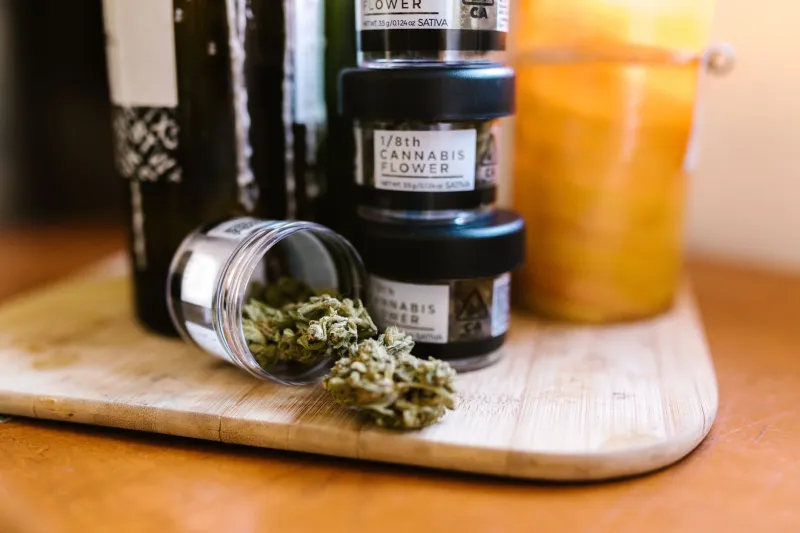
From Pharmacy Vibes to Actual Shopping: Why Dispensaries Need a Design Intervention
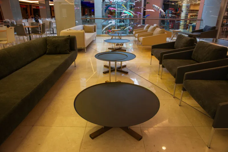
There's a moment most cannabis shoppers know well. You push open the door to a dispensary, hand your ID to someone behind bulletproof glass, and get directed to a waiting room that feels somewhere between a DMV satellite office and a walk-in clinic. You sit. You scroll a digital menu you can't quite parse. Eventually someone calls your name and you've got about four minutes to figure out what you actually want.
This is the cannabis shopping experience for millions of Americans — and it's a far cry from what the industry likes to promise in its marketing.
The Gap Between the Brand and the Build-Out
Spend five minutes on any dispensary's Instagram and you'll see moody product photography, sleek packaging, and lifestyle shots that wouldn't look out of place in a Kinfolk magazine spread. Then walk into the actual store.
The disconnect is stark. And it's not just an aesthetic gripe. Poor retail design has measurable consequences: customers leave without buying, they buy the wrong thing, or they feel too rushed and overwhelmed to ask the questions they actually have.
"We talk to people all the time who say they just grabbed whatever the budtender recommended because they felt like they were holding up the line," says one retail consultant who has worked with dispensaries across Colorado and Illinois. "That's not a good experience. That's anxiety with a receipt."
Craft beer shops figured this out years ago. So did specialty coffee, high-end sneaker boutiques, and wine retailers. The physical environment communicates something to shoppers before a single word is spoken. It sets expectations, invites exploration, and either earns trust or erodes it.
Cannabis retail, by and large, hasn't caught up.
Why Cannabis Stores Ended Up This Way
To be fair, dispensaries didn't choose clinical design out of laziness. Most of the awkward layouts, the waiting rooms, the buzzer systems, and the locked display cases are artifacts of regulatory environments that treated cannabis retail like a controlled pharmaceutical operation — because, legally, that's often exactly what it was.
Early state frameworks in places like California and Colorado required dispensaries to operate with strict security protocols, limited floor access, and product stored behind barriers. Some of those rules made sense at the time. Others were holdovers from prohibitionist-era thinking that assumed cannabis customers needed to be managed rather than served.
Over time, many states have loosened those requirements — but the design habits stuck. Operators who built their first stores in 2010 or 2015 under one set of rules kept those blueprints when they expanded. New operators copied what they saw from established players. The waiting room became standard.
"There's also a real conservatism in this industry when it comes to spending on the physical space," notes one dispensary owner in Michigan who recently redesigned her store. "Licensing costs so much, compliance costs so much, that when it comes time to actually build out the retail floor, you're trying to cut corners. And the customer experience is usually what gets cut."
What Customers Actually Want (And Aren't Getting)
Talk to regular cannabis shoppers and a few themes come up consistently.
First: information. People want to understand what they're buying — not just strain names and THC percentages, but what the experience is actually going to feel like. Most dispensary signage and menus do a poor job of this. A product card that says "Indica / 27% THC / $45" tells a curious new customer almost nothing useful.
Second: time. Shoppers don't want to feel rushed. The waiting-room-to-counter model creates a bottleneck that pressures both the customer and the budtender to transact quickly rather than consult meaningfully.
Third: discovery. One of the genuine pleasures of shopping at a good specialty retailer is finding something you didn't know you were looking for. That's nearly impossible when products are locked in cases and you can't pick anything up, smell it, or browse at your own pace.
The Stores Getting It Right
A handful of dispensaries around the country have started treating retail design as a serious competitive advantage — and it shows.
In Portland, Oregon, a boutique operator redesigned their floor plan to eliminate the waiting room entirely, replacing it with an open browsing area where customers can explore at their own pace before speaking with staff. Products are displayed in open cases with detailed tasting-note-style cards that describe effects, flavor profiles, and best use cases in plain language. Sales increased noticeably in the first quarter after the redesign.
In Chicago, one multi-location operator invested in what they call "education zones" — small, dedicated sections of the floor where first-time or curious customers can learn about consumption methods, read about terpenes, and use a simple digital tool to narrow down what they're looking for before they ever talk to a budtender. Staff report that conversations with customers who've spent time in those zones are dramatically more productive.
Down in Austin — where Texas finally opened the door to broader medical access — early operators are watching these examples closely. The ones building new stores now have the advantage of designing without legacy constraints.
The Budtender Problem Nobody Talks About
Here's a wrinkle that good retail design can actually help solve: budtender burnout and inconsistency.
When the physical environment does zero work to educate or orient customers, every single bit of that load falls on the person behind the counter. That's exhausting, and it's also inconsistent — because not every budtender has the same depth of knowledge, and not every customer gets the same quality of guidance depending on who they happen to talk to.
Smarter store design distributes that load. Good signage, thoughtful product displays, and clear category navigation mean customers arrive at the counter with better questions and more context. The budtender becomes a consultant rather than an explainer-from-scratch. That's better for staff retention, better for the customer, and better for the sale.
What a Redesign Actually Costs
One reason operators hesitate is the assumption that better design means expensive design. That's not necessarily true.
Some of the highest-impact changes are relatively low-cost: rewriting product cards in plain, useful language instead of technical jargon. Rearranging floor flow so browsing feels natural. Adding a simple "new to cannabis" section with approachable products and clear guidance. Training staff to slow down and ask better intake questions.
The bigger investments — custom millwork, digital interactive displays, full layout overhauls — do cost more. But operators who've made those investments consistently report that the average transaction value goes up, customer return rates improve, and word-of-mouth referrals increase. In a market that's getting more competitive by the month, that's not a luxury. It's a survival strategy.
The Bottom Line
Cannabis is legal in a growing majority of U.S. states. The consumer base has expanded well beyond the early-adopter crowd into mainstream shoppers who have options, who do research, and who will drive past your dispensary to go somewhere that actually feels good to shop at.
The waiting room model had its moment. It made sense when the industry was operating in legal gray zones and operators were just trying to stay compliant and keep the lights on. But that era is over for a lot of the country, and the shops that recognize it — and invest accordingly in the physical experience they offer — are the ones that are going to define what cannabis retail looks like for the next decade.
The buzzer and the plastic chair can go. Your customers will thank you.